In the winter of 2019, my dear friend from high school, Shelby Johnson (Clinical Psychology, PhD candidate at Washington State), was finishing a post-graduate research essay. Put simply, she wrote about how multi-lingual people have a larger and more colorful emotional vocabulary, and built her essay around research that showed that the more articulate one is with describing how they feel, the easier it is for them to process those feelings.
I had a brainwave, then, as someone who speaks multiple languages myself, and decided to make my graduating Capstone a user-experience that served as a multi-lingual emotional vernacular dictionary, to allow people to educate themselves and increase their own emotional intelligence. I rushed to speak to my professors about it, and though they thought the idea had merit, I was gently-but-firmly reminded that I ought not get too ambitious.
It was Professor Cassini Nazir (formerly of UT Dallas, now at UNT) who pointed me in a new direction. We'd spoken in class about Dr. Robert Plutchik, a man who studied color theory as it related to emotional responses, and from there I had to sit down and figure out what exactly I was trying to make.
I am a firm believer in using IDEO's Frame Your Design Kit at the beginning of every project, to help clarify purpose, scope, and goalposts. The process gave me the following:
Developing emotional self-awareness and improving emotional well-being.
How might we encourage self-awareness and growth?
I want people to recognize what they're feeling, and have tools that they've learned to use in order to process those feelings.
I found the following as usable tools in my research: increased emotional vocabulary, meditation, active awareness exercises, mood music, and intentional thought redirection.
Emotions are uniquely individual to the individual, as redundant as that sounds. Any solution needs to be universally accessible to people of different backgrounds and education levels. I have to remember that I am attempting to complete a relatively large project for a single person, and not bite off more than I can chew.
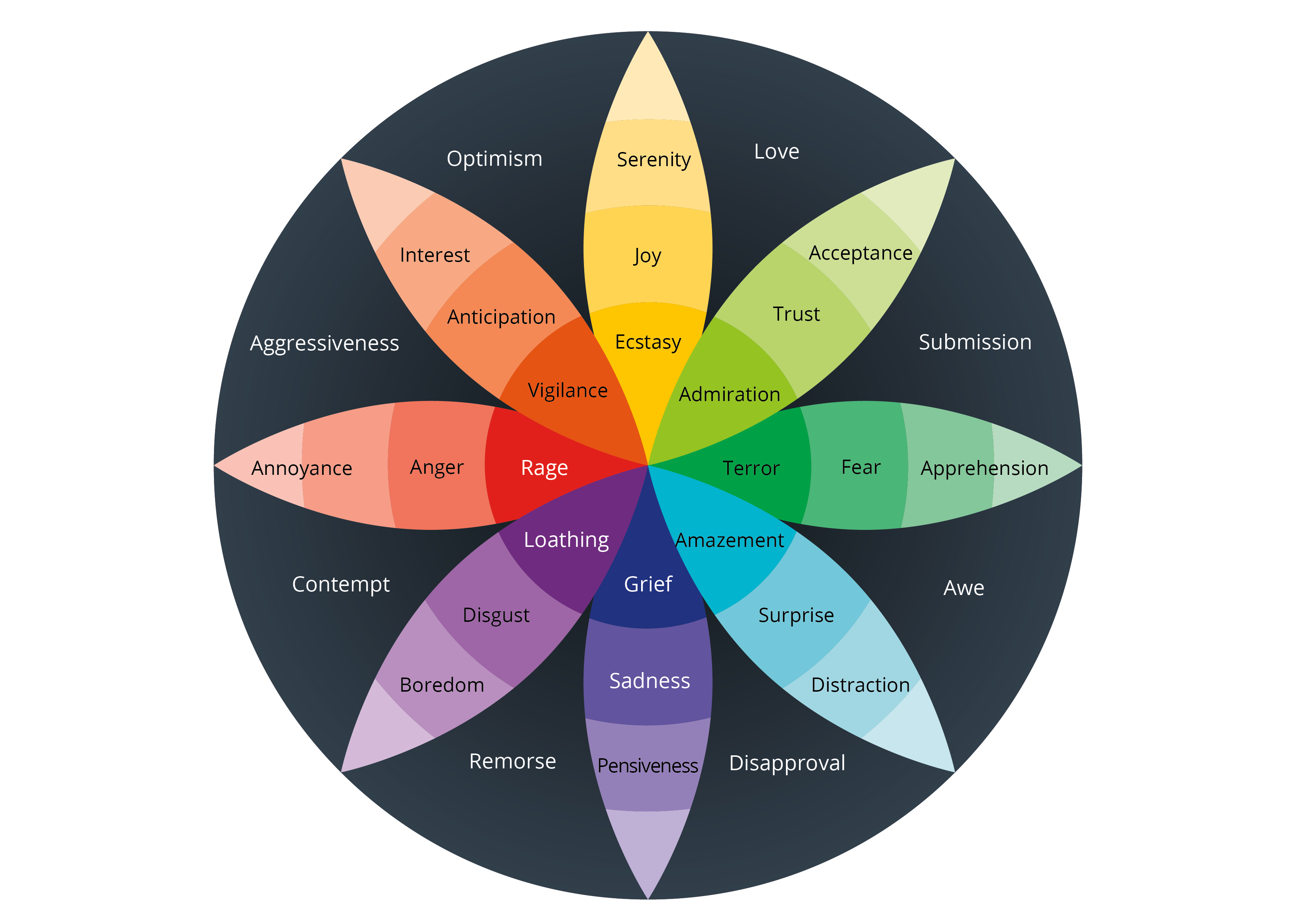
My research began with Dr. Robert Plutchik's Color Wheel of Emotions. This would serve as the foundation of my user experience. His research indicated that emotion consists of five components:

Color Wheel of Emotions by Dr. Robert Plutchik
So the goal is to objectify and understand our emotions, empathize with ourselves (validating the self), and then channel the emotion productively (changing mood or taking action). From here, I began to develop a concept for the user experience.
I started off asking a few questions I considered key to understanding my audience. I gained a few key insights.
Based on a random sample size of 43, it seems that despite over 60% of people checking in with themselves at least frequently, the same proportion feel overwhelmed by their emotions with approximately the same frequency. This implies that a large number of people need help intuiting and processing their emotions on a regular basis, so I can safely say that my idea for a user experience has a definitive audience. My next step here is to identify specific user personas within that audience to model their behaviors and attitudes in relation to my intended user experience.
Users also responded with their preferred methods of relaxing and improving their mood. The full list of responses can be found here.
My major takeaways were the following:
I ended up polling the same audience about their demographics, trying to understand who was interested in a product to help navigate their daily emotional well-being, and came across the following insights:
| Demographic: | Who are they? | What is their main goal? | What are their major obstacles? |
|---|---|---|---|
| 13-18 year-old Americans, often female | Identifies as a High School Student | They want to learn how to control their emotions and not let their feelings overwhelm them. When they fail, their mental health can get in the way of school, social outings, and extracurriculars | Youth and inexperience, lack of time management skills, poor impulse control |
| 19-25 year-old Americans, gender non-specific | Identifies as a College Student | They need a method to destress without destabilizing themselves. They need to be able to focus on school without losing their mind, while also inevitably dealing with the consequences of acting in a larger world as an adult for the first time | Busy schedules, critical life choices/lack of counseling extreme future-anxiety, easy access to/presence of substances that can be abused as a crutch |
| 25-55 year-old Americans, gender non-specific | Identifies as a Working Professional | They want to keep on top of their mental health while staying on top of their professional game as well, allowing them to maintain a healthy work-life balance and generally being happy | Demanding jobs, demands of family life, pride/ego, age-related lack of mental flexibility |
I derived the above table by aggregating the common responses to the poll. These three age-groups sort of grouped themselves up by responding very similarly. I took note of that, and developed the following user personas.

“I have to finish my homework during lunch because after class I have volleyball practice, then I work from 6 to 10 and I have to FaceTime my boyfriend while he’s on the bus home from his tournament, and don’t even get me started on when I’ll find time to study for the Physics test on Friday, plus Julia thinks she’s gonna wear the same color as me to Homecoming, please, as if!”
17 y.o. Female Latina-American from Mesa, Arizona
Jackie is a high-achieving junior in high-school who works part-time, plays on the school volleyball team, and is preparing to apply for colleges. Jackie is navigating young-adult life in the USA on her own, her parents are immigrants, and she doesn’t have older siblings or cousins who have gone through the system. She’s figuring out college apps, financial aid, scholarships, and more all on her own. On top of that, money is tight at home, so she works part-time to help out. Her boyfriend takes a chunk of her time every day, and her family monopolizes what’s left.
Jackie often feels like she has no time left for herself anymore. She knows things will calm down when she’s not in such a whirlwind in a few months’ time, but right now she feels like she’s on the verge of a breakdown. She wants to make sure she doesn’t drop the ball with regards to any aspect of her life.

“I can’t afford to get high this weekend, both financially and in terms of schedule. I’ve got the biology lab report to do, and I just went to the Math Lab so thank god my calculus homework is done. But my parents are gonna be visiting this weekend, and I can’t use with them around. Plus, I’m pretty much broke till they arrive. They’re gonna be pissed because I’m thinking about changing my major, this late into the degree plan. I just don’t know that I want to sit in an office playing code-monkey forever, you know?”
21 y.o. Japanese-American Gender Non-Binary from Austin, Texas
Skyler is a junior in college who doubts their choice to become a software engineer. There’s pressure from their parents to succeed, but they want to pursue something more creative. They’re having trouble with keeping up with some of their classes, but honestly the biggest issue they face is the number of days they use weed or cheap booze to deal with their crushing anxiety. Though they have access to university-sponsored support networks, they don’t feel comfortable going to them for some reason.
They want to work but their parents won’t allow it, and they often feel like their life will never be decided by their own choices, but rather by the whims of all the authority figures around them. Sometimes they feel like they’re being pushed into feeling a million things at once, and just want to find clarity. Skyler wants to feel like they’re in control and know where they’re going.

“Yeah, work is good, up for a promotion but there are a few good men up for the same role so, fingers crossed, I guess. The wife is expecting again, so there’s that. I’m trying to figure out if it makes sense to have a third kid almost a decade after the first two, but she’s so excited and happy, I can’t talk to her about it. That HR guy that transferred in seems to have it in for me, he’s constantly trying to catch me out on one thing or another. Getting on my nerves in a big way, that is. I feel like I’ve found a solid groove, I’m just worried I’m in a rut. Maybe that’s why the baby bothers me so much, maybe it’s because it upends my previously well-established plans for the future. Maybe that’s a good thing?”
38 y.o. Caucasian-American Male from Chicago, Illinois
John worked hard in high school and college, landed a solid job in sales, and has worked his way to a lower-level executive position. He has continuing career aspirations, so he continues to devote time to his job, even as his youngest child is finishing elementary school. He recently found out he’s having another child, something that is rocking his boat a fair bit. His wife and parents are all excited, but he has these niggling doubts that can’t put words to. He’s concerned about the affordability of another child, even though he’s pretty financially stable.
He feels like he isn’t taking much time to take care of himself, and it’s beginning to show. John wants to reconnect with himself and his roots, get back into the swing of life, and be the go-getter he remembers being.

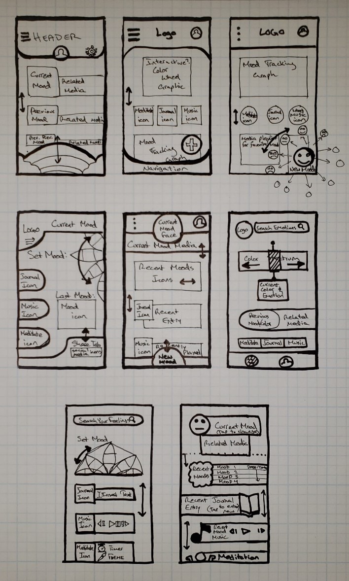
I used the Crazy Eights design sprint method to generate a series of initial wireframes to serve as a starting point in terms of functionality. From my research and development of user personas, I had identified a number of key features that I wanted to implement.
With these key features in mind, I generated eight wireframes in about eight minutes, trying out a variety of design styles. Some with headers, some with search bars, some with scroll wheels and color sliders. I presented these to a group of 15 users and asked the following:
The answers that I received to these questions informed me greatly. The feedback indicated that a rotating wheel of emotions was highly interactive and eye-catching, which serves the key feature of selecting a mood well. Users indicated they did not expect a scrolling page, as based on the pitch they expected a lifestyle app with a relatively static homepage, not a dynamic scrolling feed like a social media app.
Overall this user testing session guided me towards which of the features off the different wireframes could be adapted and fit together into an interactive prototype.
I ended up focusing a fair amount of my time in developing the onboarding experience. For this user experience to truly help users, it needs to know a fair bit about them. For it to customize the experience to the individual user, that means collecting data in onboarding without it being a hindrance.
This first pass did a very basic job of collecting user data. When I tested it with users, I observed the following:
These comments helped me to refine my approach. I studied a number of other onboarding experiences to better understand their immersive and intuitive natures. The most prominent of these was Spotify, which is often lauded for its onboarding user experience. I won't go into detail about the choices made by their design team, though you can check out this quiz here if you're curious to know more.
I decided to implement a few changes.
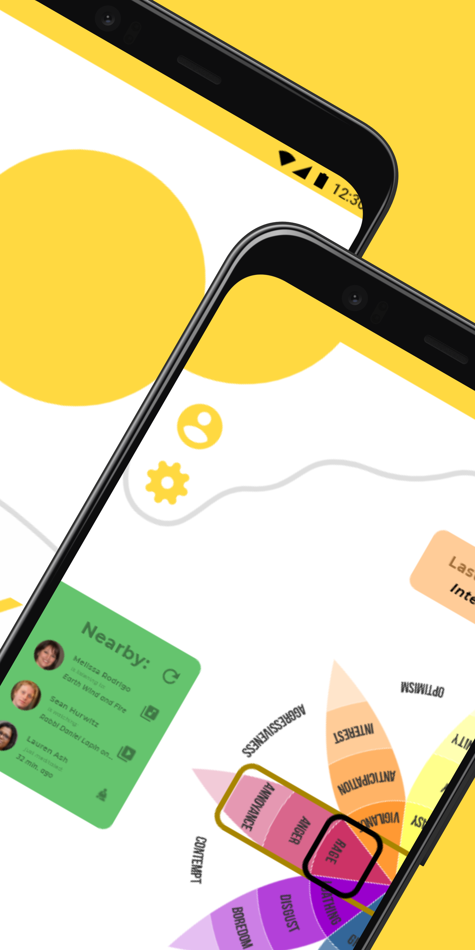
Check out my final prototype below. The final experience includes a homepage where users can scroll through the color wheel of emotions, select a color off the spoke of the wheel they're looking at, and set their mood. They can see what people nearby have been doing with the app, they can share to their own social media that they're using the app. The users can also access their journal, the guided music experience, and the meditation experience through that. I didn't have the opportunity to research and build out the guided music experience, although if I get the chance in the future I hope to do so.
This project is the culmination of my career as a student at the University of Texas at Dallas, and specifically in the school of Arts, Technology, and Emerging Communications. Discovering the field of User Experience saved me from myself, and it means the world to me to get to pursue my dream of a creative, problem solving career.
The first and most important thank you has to go to my family. To my mother, Fareeha Miandara, for obvious reasons (like raising me), but even moreso for understanding why I needed to switch majors and pursue a completely different path than what we'd previously planned. Thank you for valuing my wants and needs. To my brother and sister, sorry for taking so long to graduate. I know it's been stressful, since I was supposed to kind of be handling the house by now. Thank you to both of you for your understanding as I walked this path.
Thank you to the people who supported my path through my final years in school financially, I am eternally grateful for your help. I love and serve the Dallas community because of the compassion and generosity that I have had firsthand experience with throughout the years. Here, in my most recent time of need, you all came through once more. I want nothing more than to one day sign a check for someone that is as lifechanging as the ones you all signed on my behalf. I'll settle for giving back to the community in any way possible with my current resources, for now.
I would say thank you to my friends, who let me complain at them a thousand and one times about anything and everything related to school, but you guys are also low-key part of the reason I was such a bad student in the beginning, so we'll call it even.
Thank you to the professors who helped ignite a passion for design and research in me. Professors like Cassini Nazir, who taught me to think creatively and critically about interactions; Dr. Angela Lee, who pushed me to be critical of published research and of any research I conduct myself; Professor John Petty, who reminded me to pursue my creative dreams alongside my professional ones; and all the teachers I've had on the way who helped me become a better me.
Thank you to my Academic Advisor, Kelley Henderson, for being a truly phenomenal advisor. It took me 6.5 years to graduate, but it would have been more without her help!
Finally, thank God, above all else, for blessing me with the people above and the opportunities to succeed. Nothing is possible without His blessing. May He give us all what is best for us, ameen.